Nobody talks about colour when they talk about planning systems, and yet it decides the most practical thing of all: whether you can stand looking at the page in month six. Three factors matter far more than taste.
1. Contrast decides how long you can work on it
A page with a pale background and medium-strength ink is comfortable for an hour. High-contrast black-on-bright-white feels sharp for ten minutes and tiring after thirty. This is why our palettes use soft, low-saturation backgrounds with darker accents rather than plain white.
2. Ink cost, if you print
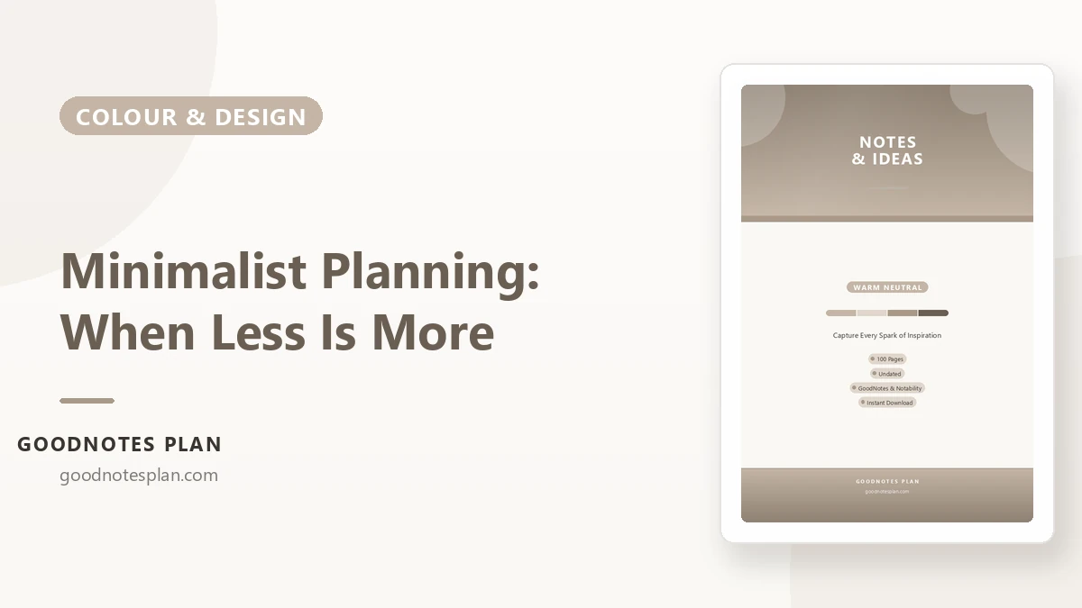
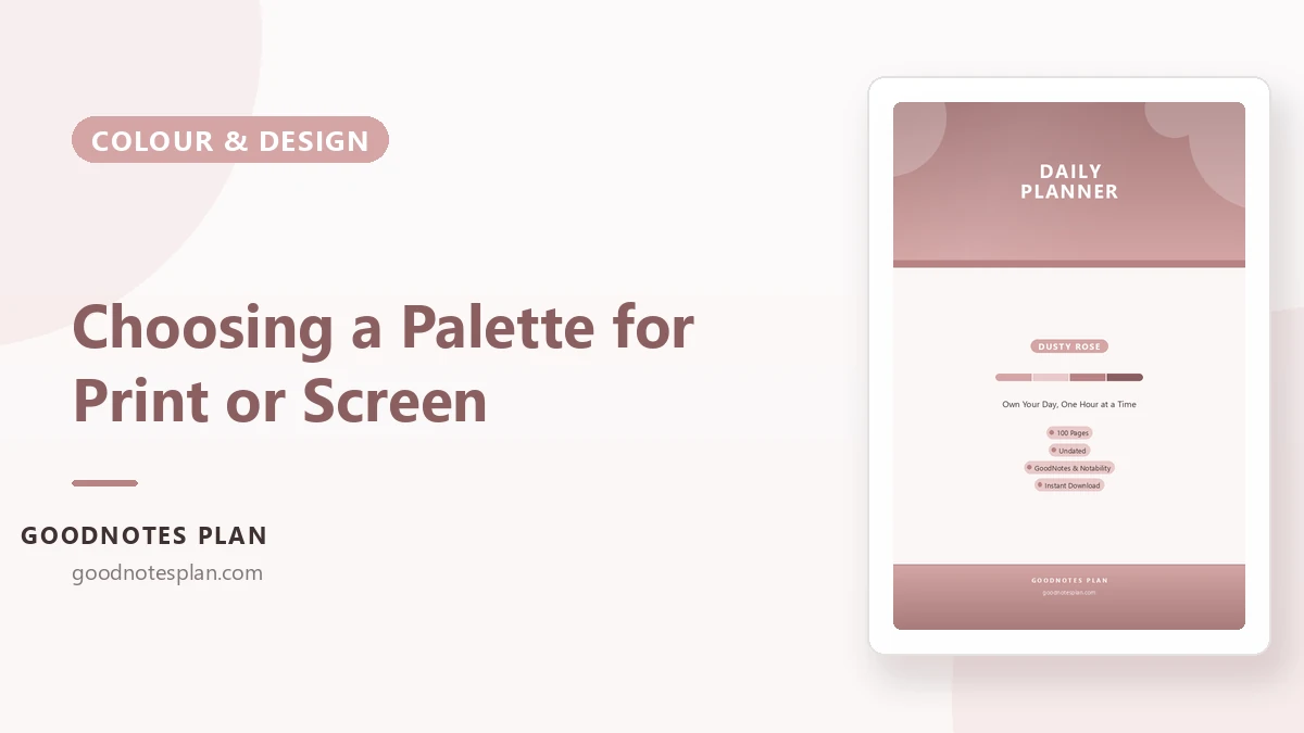
- Lightest on ink: Warm Neutral, Dusty Rose, Lavender Dream — mostly pale washes.
- Moderate: Blush Pink, Sage Green, Mint Fresh, Terracotta Warm.
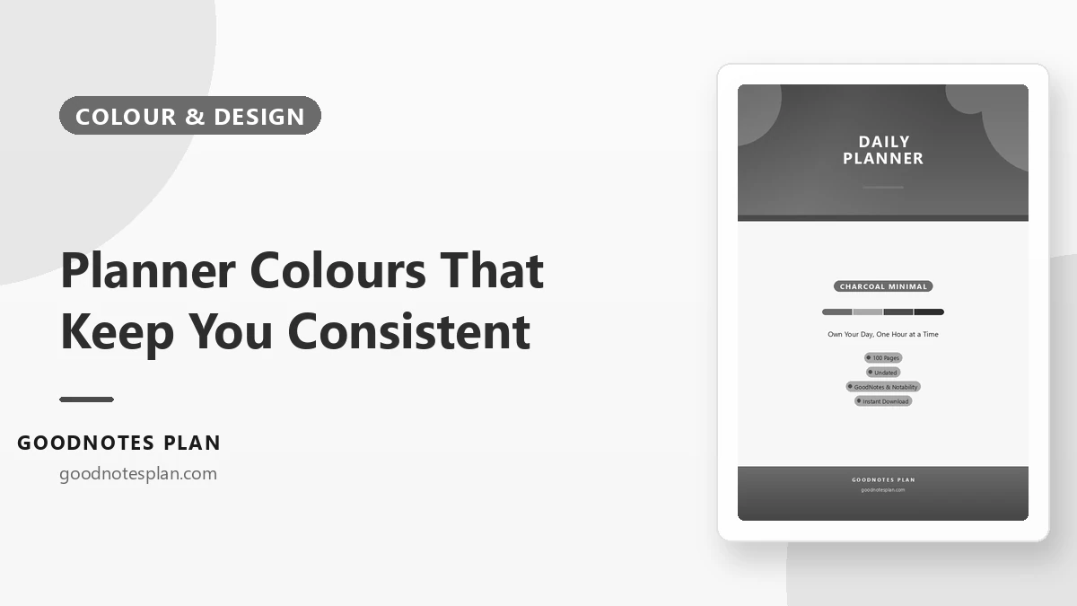
- Heaviest: Soft Navy, Coral Sunset, Charcoal Minimal — the dark headers and footers cover real area.
Printing the header page in colour and the writing pages in greyscale is a good compromise for any palette.
3. What each palette is best at
| Palette | Feels like | Best for |
|---|---|---|
| Blush Pink | Warm and gentle | Daily planning, journalling, a soft but cheerful start |
| Sage Green | Calm, natural | Habit tracking, study, long sessions |
| Lavender Dream | Quiet and reflective | Self-care, evening pages, low-stimulation work |
| Terracotta Warm | Grounded, earthy | Budgets and admin — makes paperwork feel less cold |
| Mint Fresh | Light and clean | Meal planning, checklists, kitchen and household |
| Soft Navy | Serious but soft | Work, training logs, anything you want taken seriously |
| Coral Sunset | Energetic | Goal setting, challenges, motivation-heavy months |
| Warm Neutral | Minimal, paper-like | People who dislike colour; easily printed cheaply |
| Dusty Rose | Muted and elegant | Journals and long-term records |
| Charcoal Minimal | Focused, ink-and-paper | Deep work, minimal desks, maximum contrast |
Three quick rules
- Match the page to the job. Muted, low-contrast palettes for pages you stare at (daily, journal, study). Stronger palettes for pages you flick through (goals, reviews, trackers).
- Match your setup. A pink planner on a pink desk stops feeling like a compromise. A black-on-cream planner on a minimal desk disappears in the best way.
- Choose for month six, not week one. Novelty wears off. If you would still enjoy writing in it in a quiet February, that is the palette.
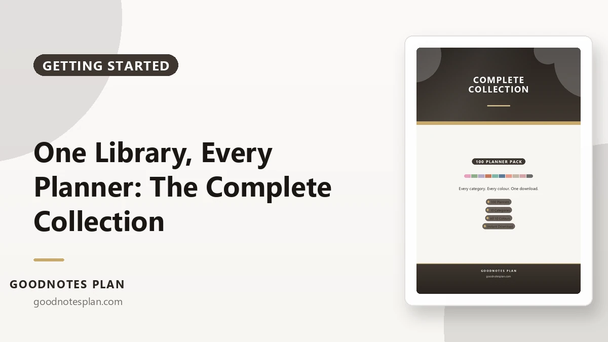
If you genuinely cannot choose, that is a good argument for a colour pack: one price, all ten palettes, and you can change your mind every month without buying anything again.