Ink coverage decides print cost
A page with large areas of dark colour uses several times the ink of a light, low-contrast page. If you print weekly, favour light backgrounds and coloured accents rather than coloured blocks.
Contrast decides how it feels to use
On screen, a little more contrast than you would choose on paper tends to read better — especially in a dim room or on a tablet at low brightness. On paper the reverse is true: heavy dark headers look bolder than they feel when you are writing in them.
Watch dark-mode tablets
Many PDF apps invert or dim colours. If you plan at night, test your chosen palette in your actual app with your actual brightness setting before committing to a hundred pages of it.
Consider two palettes
One calm, light palette for printing and one with stronger colour for the tablet costs nothing extra — the pack includes every palette — and it means the planner suits both jobs rather than compromising on one.
Where this lives in a planner
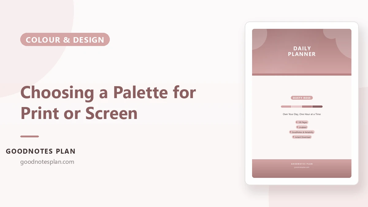
Every technique above has a home on the Daily Planner — Dusty Rose — undated, A4, and ready for GoodNotes, Notability or a home printer. Not ready to buy? Download the free starter kit and try the method first.